Do you want to have an amazing Facebook cover image that summarizes your business, attracts new readers, and converts into clicks on your website? That doesn’t sound like too much to want, in fact it is totally attainable. I feel that Facebook cover photos are used just for “looks” and they can accomplish SO much more. Today I want to share with you how to create a Facebook cover image that converts…
Here are my tried and true tips for creating a Facebook cover image that converts:
Branding
The colors, mood, and tone that you use on your website should be echoed onto your Facebook cover image. Remember, that everything that you put out there regarding your brand, should be well – branded. 🙂 Here is an example of my past and current cover images…
This little gal has been the cover photo that I have had for a while. It is definitely branded and pretty, but it DID NOT convert. Nothing about this cover image says, click me – check my site out – work with me – get to know me – nada – nothing – nope. So was it fulfilling it’s purpose for my Facebok page? Sadly, no and for a long time it was doing nothing for my business. Now on the surface, there seems to be nothing wrong with this photo. It is branded, pretty, welcoming, and a great reflection of my brand.
Now, let’s compare this one to my current cover image…
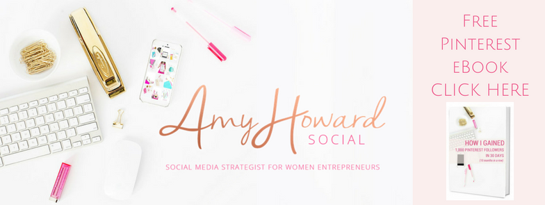
So pretty right?! 🙂 My new cover image represents my brand well, it has my logo stating who I am and what I do, and it also has a CALL-TO-ACTION! Which photo would you be more apt to click on?
Add a Call to Action + Description to your Image
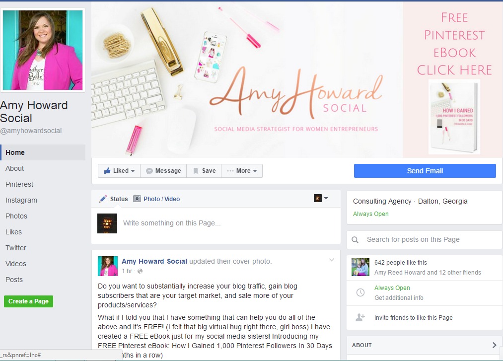
Whether people like to admit it or not, we like being told what to do and we like things to be easy to find. Of course we want our Facebook fans to click over to our website and yes our links are readily available to them – however seeing an image that says “CLICK HERE” “SIGN UP HERE” GRAB YOUR FREEBIE HERE” “CLICK HERE TO SAVE” etc. will make the people will click, sister. Here is an example of what my cover photo looks like on my Facebook business page:
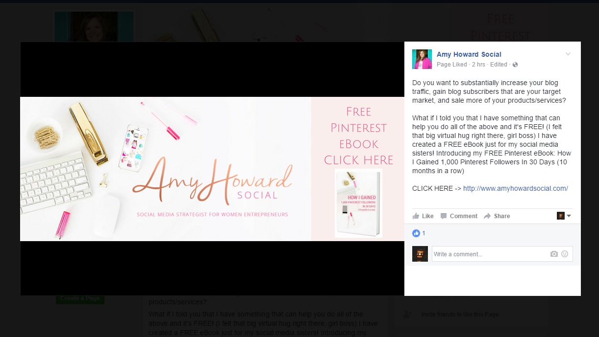
Here is the most important part about adding a call-to-action to your Facebook cover image – ADD A DESCRIPTION TO THE PHOTO. Once someone clicks on your snazzy Facebook cover photo, this is the screen that they will see. The text on the right is the photo’s description. Type in that area more details about what your call-to-action is referring to and ALWAYS include a clickable link! This is the entire point – to get Facebook visitors to click over to the website, subscribe, and become loyal customers.
Mind Blown?! Believe me, I was when I started thinking more about my cover image.
Update Regularly
Since you will now be displaying a Facebook cover image that will convert, you will want to update it regularly for your current promotions. Consider adding a new cover photo displaying upcoming launches, services, opt-in freebies, a new blog post, etc. Plus, every time you add a new photo on Facebook -including your cover image- it gets updated in the news feed, so you’ll gain more exposure each time you switch to a new cover image. Holla!
Tips for Creating Facebook Cover Images
I create my cover photos in PicMonkey and Canva – lately I have been using Canva more. I prefer PicMonkey more for editing photos. Both softwares offer a FACEBOOK COVER IMAGE option when you are choosing designs so just use those dimensions. Add your branded image(s) + call-to-action. Next you will want to upload it to your Facebook page. Hover your mouse on the bottom right corner and you will see the option to change your current cover photo. Click that and upload your new design – before clicking SAVE you can drag the image to make sure that it looks polished and clean. If you need to make any changes, just go back to PicMonkey or Canva and do them. Repeat this until you have an image that you like.
Now – we need to add the description to the photo. After the photo is uploaded and set as your new cover image, click on it. Next, click edit and add more details about your call-to-action + your link. Then hit save. That’s it!
So now, I have a little promise that I wish for you all to make with me. I promise to head over to Facebook and change my Facebook cover photo into an image that will convert. Comment below if you are on board with us! Do you have more tips, tricks or advice? Share that too! I can’t wait to everyone’s new fancy Facebook cover images!
DON’T FORGET IT : PIN IT!

stock photography provided by Haute Chocolate, my go-to for feminine, affordable styled stock photography. check out the Haute Chocolate stock library, here.





This is fantastic! I’ve known I needed better content on my fb pic but didn’t know exactly how to do it. This post has given me some great ideas and I already use Canva so I’m ready to go!!! Thanks!
I did it! https://www.facebook.com/Angela-Tyler-1276260475759884/
You’ve read my mind! This was on my task list for this weekend during “Daddy Daughter time” when I have some quiet. Thank you so much for this!
I changed mine up! I’m excited to see if I get more “likes” because of it 🙂 Thanks! Would you mind sharing how you got your name font onto your cover photo here> and also how you made it an ombre color?!
Hey Amy – Thanks for the great tips, really useful!
I just changed mine! What do you think? https://www.facebook.com/anaramirezphotography/
Thank you for the great tips! I use PowerPoint to create graphics, and followed your advice to create a clickable cover. Here it is: https://www.facebook.com/traumaticillness.
Amy, this was SO helpful. I’ve been putting my FB page on the backburner for so long but this just reminded me of why I need to kick it in gear. Thank you!
I started on mine when I saw your cover before & after! Done! Thanks for sharing this info!