Instagram has a new logo as well as a few visual updates!! Keep reading to stay in the know of these awesome updates and how to make sure that your app is updated to the latest version.
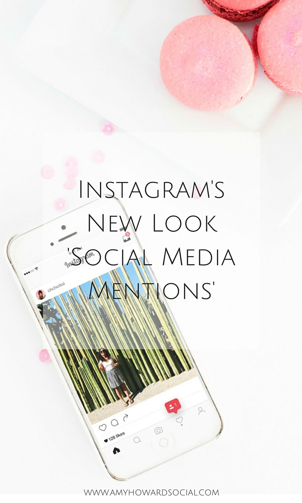
Instagram has ditched its logo for a new purple, orange and pink icon, as well as redesigning its app to make its menus and background entirely black and white. The former logo, a retro brown and cream camera with a rainbow stripe that harked back to the iconic Polaroid cameras, was instantly recognisable, but has been radically changed. Here is a how the new logo looks now…
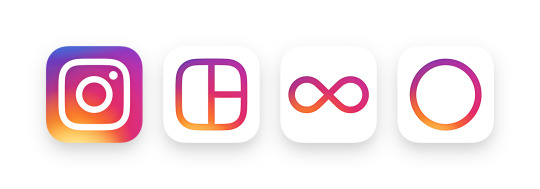
You’ll also see updated icons for Instagram’s other creative apps: Layout, Boomerang and Hyperlapse.
The Instagram community has evolved over the past five years from a place to share filtered photos to so much more — a global community of interests sharing more than 80 million photos and videos every day. Their updated look reflects how vibrant and diverse our storytelling has become. As well as the new logo, Instagram has also changed its app to a new black-and-white design for backgrounds, icons and menus. The more muted design is intended to make photos stand out more, although there have been no changes to how the app works. I personally LOVE this new look. The photos and text are much easier to read!
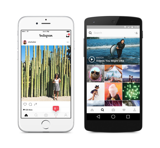
One of my favorite parts are the PINK NOTIFICATIONS at the bottom of your screen. Now, whenever there is a new notification or message, a cute little pink notification will pop up. Thanks #Instagram!

To make sure that you are staying up to date with these fabulous Instagram updates, simply update your app on your mobile phone! You will then see all of these pretty changes and enjoy Instagram even more than you already were!
So, what are your thoughts on Instagram’s new look? Do you prefer the latest version or the older? I would love to hear your thoughts on the news, comment below and let’s chat!
DON’T FORGET IT : PIN IT!

Source: Instagram Blog


I went ahead and updated Instagram on my Android after reading this. I gotta say, I really like the updates, including the logo change. In a Facebook group I’m in, someone was complaining about the new look, but I think it’s a modern and welcome change.
Tiffany recently posted…5 Free Image Editing Programs
Hey Tiffany,
I love the new look! I think the photos and copy stand out more with the all white background. Thanks for stopping by lady!
xo,
Amy
I have already heard many people disliking the new logo and features of IG. I actually think its great because the pictures stand out so much more. I do understand that so much white isn’t as easy on the eyes but I think people will get used to it. I just found your blog yesterday and I love love love it. You’ve reignited my passion for blogging which is great cause I have anew project I’m working on. I’ll share when it gets closer to being ready to launch. Thank you for your hard work, it shows 🙂
Hi Kylie,
I totally agree with you – I think that the changes are great and the photos stand out more. I am so glad that you found me and stopped by – I would love to learn more about your project that is launching soon! Shoot me an email any time at contact@amyhowardsocial.com so we can chat more. 🙂
xo,
Amy
I actually really like it and I usually do not like change!
Hi Trusha,
I am not a big fan of change either and I am digging these changes as well! Kudos to Instagram.
Thanks for commenting and stopping by lady!
xo,
Amy
[…] more About Instagram’s New Look ~ Social Media Mentions – Amy Howard Social (adsbygoogle = window.adsbygoogle || […]